***This article originally appeared in the February ’23 issue of Animation Magazine (No. 327)***
Some of today’s top character designers discuss their craft and challenges.
Things are looking a little bit simpler ─ literally ─ in the array of animated features circling over the Oscar field, requesting landing approval. Many of this year’s contenders have dialed back on digital realism to achieve new looks, tones and styles, particularly in terms of character design.
“Previously in the 3D world you were pushing the limits of animation to see how realistic you could go,” says Taylor Krahenbuhl, character designer for DreamWorks Animations’ The Bad Guys. “Our director Pierre Perifel said, ‘What if we did The Bad Guys in an Akira Toriyama/Dragon Ball kind of way? What if we made it childlike with animation driven with key poses and key frames that really push the medium, and try to get a bit of 2D stylistic choices as well?’”

Spotlight on Cartoony CG Characters

While the characters in the film definitely lean toward the cartoony, Krahenbuhl kept the focus on their eyes. “We found that once we did the characters with a dark eyebrow shape that accented and framed and silhouetted the eyes, we were finding a special dynamic,” he states.
The eyes may have it for the film’s human characters, but their noses don’t, being barely perceptible. “I remember a note from Pierre specifically saying, ‘Okay, that nose looks too big, make it a bit smaller,’” Krahenbuhl says. “We did and felt it worked. In 3D, when you light a scene, every form is going to have a cast shadow on it that is going to create other shapes and graphic forms. The more you can restrain within that form, the cleaner it is.”
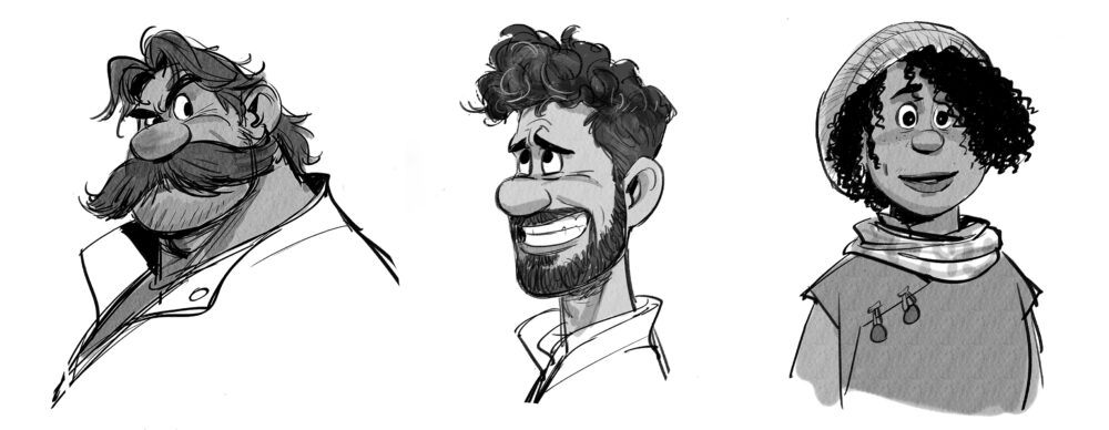
Proboscis patterning was also a factor for character designer Jin Kim in crafting the characters for Disney’s Strange World, but in the opposite direction.

“The [family characters] all have common noses … huge and round,” he says. “Even Legend the dog has a big nose.” Kim states that he drew inspiration for the designs from European comic books, notably Asterix. “Our director Don Hall really likes the French/Belgian comic-book style, especially by the artist Didier Conrad,” Kim states. “[Conrad] uses a lot of curves, so we made sure everything was soft and round.”
The most difficult character in Strange World from a design standpoint, though, was one with no nose at all … or any other facial feature. “The Splat was the most challenging,” Kim says of the film’s amorphous, tentacled blob. “It looks simple and easy, but characters that are simple are harder to design because they have to communicate to the audience somehow with no eyes, nose or mouth.” The designer studied the similarly featureless-yet-endearing character of the Flying Carpet in Aladdin for inspiration.
Let the Feline Fur Fly

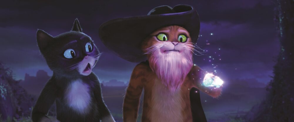
Nate Wragg, the production designer for DreamWorks Animation’s Puss in Boots: The Last Wish, drew upon the script’s somewhat darker tone to create a more stylized universe. “In previous films, he was living in a slightly more naturalistic space,” says Wragg. “But using a more illustrative feel to the overall look, we were able to push his caricature a bit more, and surfacing-wise, back away from naturalism.”
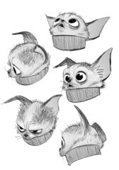
That included showing the lionhearted feline comically gone-to-seed to the point of wearing an untamed grey beard. “That was totally story driven,” Wragg says, “but what does a beard look like on a cat?” For inspiration, character designers Andrea Blasich and Jesús Alonso Iglesias studied a luxuriously hairy Maine Coon cat. “Whether it was a grooming choice by a human or it naturally grew out, they kind of look like they have beards.”
For Jason Deamer, character art director for Disney-Pixar’s Turning Red, the blow for simplicity came through the colors. “We’ve done movies where there were 52 shading colors that were done to the main character, and nobody notices,” he says. “It’s silly. If you look at the characters [in Turning Red] you’ll notice they each have a color.”
Chunky Cute Saves the Day
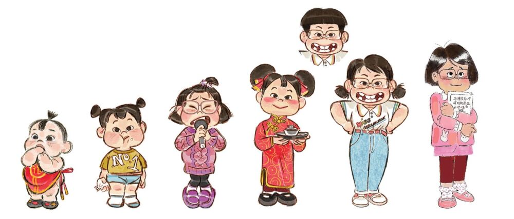
The film’s primary character designer was Keiko Murayama, who was brought in on a freelance basis by director Domee Shi. The challenge for her was keeping the lead characters convincingly youthful. “When you start to put in so much detail, they start to age,” she says. “When I first attempted to design them, they looked much taller and older. I have a tendency to draw a character who’s described as beautiful or handsome a little more elongated. So I had to make perfectly beautiful human beings into chunky, cute versions of them.”

Murayama adds that the design influence for the picture came from 1970s and ’80s anime, in which characters will often pull exaggerated expressions. “When they do that their mouths are half of their face,” she notes. “I deliberately tried to make it exaggerated and very comedic.”
Of course, the film’s signature design challenge was the fact that its star, 13-year-old Mei, turns into an enormous red panda that must still maintain her essential Mei-ness. “If you superimpose panda Mei’s eyes over human Mei, they have exactly the squircle — a square and a circle mixed together, which is what we’re calling eye shapes,” Deamer says.
At the other end of this year’s design spectrum are the characters from Netflix’s Wendell & Wild, directed by Henry Selick and produced by star and co-writer Jordan Peele and Ellen Goldsmith-Vein. Here the stop-motion-animated characters are not chunky and chubby but linear and angular. That was no surprise, since noted illustrator Pablo Lobato, who was hired to design the characters, is renowned for his Cubist style of caricature.
Crafting Cubist Characters
“I received an email out of the blue from Henry Selick and my first thought was, ‘This guy has the same name as the director of The Nightmare Before Christmas,” Lobato laughs. But it really was Selick, and Lobato really was hired for his first movie. His first task was creating caricatures of Peele and Keegan-Michael Key, the film’s star voices (co-star James Hong is also eminently recognizable through Lobato’s design).
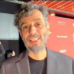
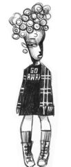
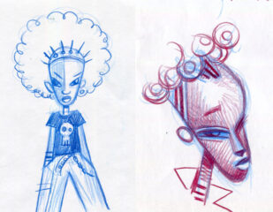
But creating the look of the film’s central character, a worldly Black teenage girl named Kat proved more difficult. “I did some sketches I was not happy with,” Lobato says. “I was concerned about the translation of 2D [drawings] to 3D, and I thought, ‘What did the Cubist guys do with 3D?’” As a result he studied Picasso’s sculptures and learned that the painter was influenced by African masks. “I looked at a beautiful, very minimalist mask,” he says. “So, I put all these things in a blender and did five or six sketches and showed Henry, and he said, ‘Okay, this is Kat.’”
Fans of Selick will not be surprised to learn there are several skeleton characters in Wendell & Wild, though designing them forced Lobato to rethink an image that everyone on the planet knows: the human skull. “I had to do six different skeletons — and there’s not much difference between your skull and my skull,” he says. “But as a designer, I thought maybe I should place them in different geometric shapes, so one is a circle, one is more rectangle and one is wide.”
Another renowned illustrator, Gris Grimly, set the graphic tone for the year’s other major stop-motion production, Guillermo del Toro’s Pinocchio, produced by Netflix Animation and The Jim Henson Company. Grimly was brought on board as character designer when Henson acquired the rights to his 2002 illustrated book of the original Collodi story. While he was responsible for the unique look of Pinocchio himself, over the next decade’s worth of development and production, some refinements were made.
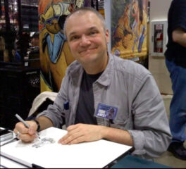
“The original designs were more whimsical and much more stylized and angular,” says Guy Davis, who along with Carlos Grangel designed the final versions of the characters. “As we went forward we pulled away from that because we needed to be more rounded.” More rounded perhaps, but much more simply textured — notably the characters’ hair, which is sculpted rather than fibered with individual, realistic strands. There was also a technical factor: originally, the Pinocchio figure (crafted by puppetmakers Mackinnon & Saunders) had a mechanical face.
Innovative Approaches
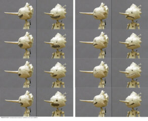
“As a metal skeleton with paddles to push around flesh, it looked almost like a talking prune,” says production designer Curt Enderle. “It didn’t have that sense of a carved solid object. This version feels like he’s made out of wood.” As per del Toro’s input, his head also has a work-in-progress appearance, which was animated using replacement faces, instead of a mechanical head.
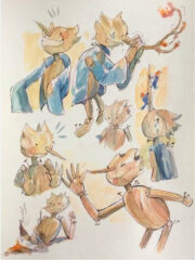
Two of the film’s more unusual characters are the Wood Sprite and her opposite sister, Death. “Death was going to be based on Greek mythology, so we added a Greek style mask,” says Davis. “The Wood Sprite has ears because the giver of life is going to listen and learn, whereas Death doesn’t have ears because it pretty much knows the answers to everything.”
Trends come and go, of course, but Nate Wragg for one sees this as a natural evolution of the medium. “CG [originally] blew everyone out of the water in terms of replicating reality,” he says. “Now we’re seeing it pivot back to, ‘Okay, we’ve done a lot of that, so how about we provide the audiences with different experiences?”



 Win a Funko X Lilo & Stitch Prize Pack!

