DreamWorks Animation lets its inner child run wild in bringing the Captain Underpants children’s books to the big screen.
In this golden age of superhero movies, who could resist wanting to see a character named Captain Underpants zoom across the silver screen?
Not DreamWorks Animation. The studio acquired in 2011 the rights to the series of illustrated children’s novels from author Dav Pilkey and set about developing it as a feature film. And when original director Rob Letterman left the project, new helmer David Soren turned out to be a fan from the books’ earliest days.
“About 20 years ago, I happened to be in a bookstore just when the first book was hitting the shelves and picked it up and probably read about half of the book right there in the aisle,” says Soren. “Years later I had kids of my own and re-read them to my kids and my kids read them on their own, so the Soren family is very well-versed in what happens.”
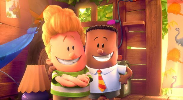
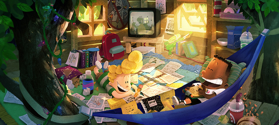
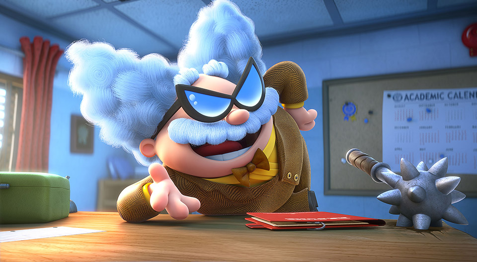
Captain Underpants: The First Epic Movie follows the adventures of fourth-graders and best friends Harold Hutchins and George Beard, who dream up their own comic-book stories and love to play pranks on their principal, Mr. Krupp. When Krupp threatens to put the boys in separate classes, the boys desperately pull out a hypnotic ring that — to their surprise — transforms Krupp into Captain Underpants every time someone snaps their fingers and he only returns to normal when doused with water. Captain Underpants believes himself to be a real superhero, attempting good deeds that draw Harold and George into many comical adventures.
The premise was ideal for an animated movie, Soren says, as it contains the kind of wish fulfillment fantasies that tend to create endearing stores. “They’re so subversive and have tons of character and personality, and the characters are really iconic,” he says.
Finding the Right Home
The books were a hit from the start and author Dav Pilkey had no shortage of offers for a movie version. He held off for a while, before deciding to go with DreamWorks, says Soren, who previously directed Turbo for DreamWorks. “I think it took a while for Dav Pilkey to get to the point where he was feeling like he was ready to let it be made into a movie,” he says.
When Soren took over directing the movie, which was scripted by Nick Kroll, it gave the project an opportunity to reassess its approach. “There had been some places that they had gone that I think the studio was feeling like they want to move off of, and I was coming in with a sort of a different take on it at the time that I think appeal to everybody,” he says.
Key to Soren’s approach was to let the best-friend relationship between Harold and George guide the creative choices. “It’s so true and so honest and it really kind of reminded me of some of the best friendships I had growing up,” says Soren. “George and Harold should be the directors of this movie. That was really the approach from when I came on until now and it really proved to be the guiding light for us.”
Getting the tone right was an early challenge on the movie. “There was a question of how earnest versus how silly versus how snarky we could allow this to be,” says Soren, who dialed that back. “We ended up in a place where they were a little more honest in how they are reacting to certain situations and that that really helped.”
The project recruited a voice cast that includes Kevin Hart as George, Thomas Middleditch as Harold, Ed Helms as Principal Krupp and Captain Underpants, Nick Kroll as Professor Poopypants, Jordan Peele as Melvin Sneedly and Kristen Schaal as lunch lady Edith.
Finding the Right Look
Visually, Soren says they sought a unique look for the movie that would set it apart from other DreamWorks releases and even from other animated features.
Starting with Pilkey’s illustrations, production designer Nate Wragg studied all the books and picked out the illustrations that best captured the spirit of the characters. This wasn’t easy given that Pilkey doesn’t draw from model sheets, so the characters are constantly changing. They also examined the environment to find ways to translate the drawings into a world that worked together.
Designing characters that would both work in CG and looked like Pilkey’s drawings required a light touch, says Rune Bennicke, head character designer and animator.
“Every time we tried to stylize them or make them a little more sophisticated of a design, they didn’t feel like they they worked with the style and with the Pilkey world,” Bennicke says. “I used to joke around, saying that being the character designer and Captain Underpants is just a fancy way of saying that I copy drawings from the books, which obviously I didn’t, but I don’t think I did any drawings without first checking the books.”
One of the more distinctive elements of the characters’ design is the use of black dots for eyes.
“It didn’t take very long to do some sketches early on that show that with a regular kind of eye, with the whites and the dots, it was like a betrayal of the characters,” says Soren. “It did take quite some time to convince the studio that the dot eyes were going to work and convey emotion in all the same ways that we’re used to using in more traditional looking movies.”
Bennicke says dot eyes are not really that difficult to do, it’s just not something that’s been done much in CG animation. “There are simple things to make it work that you can do, but it’s sort of forgotten knowledge,” he says. “Nobody really knew how to do it, so we had to reinvent that slightly.”
Among the techniques used to get emotion from the eyes were smears, head movements and different kinds of blinks. “We found a way to get lids on them so if we wanted to have a half-lidded expression or a kind of lower cheek line, we could do stuff like that,” says Soren.
An Unusual Style
Bennicke says the style of animation was unlike any other production he’s been on, in that there was little effort put into differentiating characters through performance. “On many shots, Harold and George will act the exact same way,” he says. “It goes against our instincts, but David Soren would go nope just have them do the exact same thing.”
Bennicke says that draws on a cartooning tradition and the design language of simple comic strips, citing Mort Walker’s Beetle Bailey as an example. “If the character’s walking, there are one or two different poses that he’ll use, but he’ll use them for every one of the characters,” he says. “It goes into the philosophy of this kind of design language, which is that they’re symbols; they’re not representative of any specific characters.”
As such, George and Harold use the exact same model, with only three different models used for all the kids in the movie.
Despite the relative simplicity of the look and the movements, the animation process — executed by Mikros Image in Montreal — was far from easy, says Bennicke, who sought expressions and motions that were as instantly readable as an emoji. “We thought of it as classic performances,” he says. “If Krupp is going crazy with his villainous intent to separate Harold and George then we just try to make him as crazy as possible.”
The animators looked to classic 2-D animation such as old Walt Disney shorts, Warner Bros. cartoons by Chuck Jones and Tex Avery, and even UPA and Hanna-Barbera to get a handle on old-school cartoon comedy. “We were studying a lot of stuff to figure out what what they were doing right and what we could translate to CG,” says Soren. “The lovely thing about where we’re at with the state of CG animation is you can do anything, it’s just a matter of how.”
Bennicke and Wragg were instrumental in teaching the animators to think and draw more graphically — and to work without relying on video reference.
“When you look at Dav Pilkey’s drawings, when Captain Underpants makes a fist, it doesn’t really look like a traditional fist — it’s almost like a head of cauliflower or something,” says Soren, pointing out that the books are done from the point of view that Harold and George are writing and drawing the stories themselves. “We wanted to capture that homemade feel.”


 Win a Funko X Lilo & Stitch Prize Pack!

