


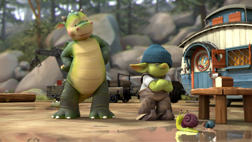
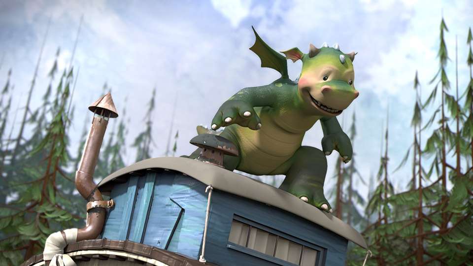
Blue-Zoo unites ambitious CG animation with broad appeal for kids in its stylish hit Nick Junior preschool series Digby Dragon.
In an era defined by remakes and adaptations, getting an original series commissioned is no easy feat, even one with a target demographic of ages 4 to 6. Which is why when British animation studio Blue-Zoo first pitched Nickelodeon’s London office with Digby Dragon, a preschool show about an anthropomorphic Scottish fire-breather and his coterie of fantastical friends, they made sure to emphasize the series’ unique blend of visual innovation coupled with old-school British charm to get the green light.
“It felt like a real heritage project,” Blue-Zoo co-founder Oli Hyatt says of the show, which was conceived by author and illustrator Sally Hunter, best known for children’s book Humphrey’s Corner. Hunter first approached Blue-Zoo in 2012 with a sketchbook full of ideas for Digby, although the timing was less than ideal since the studio had recently decided to focus only on intellectual property developed in-house. But, Hyatt recalls, he soon “fell so in love with the character” he agreed to take on the show anyway.
Nickelodeon was equally smitten and quickly snapped up Digby for the network’s preschool channel Nick Junior, on which it also airs in the United States. “We were immediately taken by Digby Dragon’s art style and, most importantly, the heart at the center of the series,” says Alison Bakunowich, GM of Nickelodeon U.K. & Ireland. “Digby Dragon is a strong British property with lots of opportunity to develop across platforms and into consumer products.”
Hyatt agrees that a large part of the show’s appeal is down to its “unapologetic” Britishness. Digby is set in Applecross Wood, a real location in Scotland where Hunter used to spend vacations with her grandparents, and, with an ensemble cast that includes characters such as Fizzy the Fairy and Grumpy Goblin, evokes classic children’s stories such as Winnie the Pooh.
In fact, the tubby little cubby, who last year celebrated his 90th anniversary, was very much an inspiration for the show during the development process. “We wanted to have a brand that had longevity,” Hyatt says, revealing that his goal for Digby was to produce “really high-quality animation and make something that felt like it wouldn’t date that easily.”
Quality Isn’t Cheap
However, high-quality animation means higher production costs. To make the show financially viable, it had to have as broad an appeal as possible, which is why a decision was made to aim Digby at an older demographic than originally planned (4- to 6-year-olds as opposed to 3-year-olds). “If you start at 3, you can never go up,” Hyatt says. “If you start at 5, you can go down.”
Visually this involved redesigning the characters to look a little less cute and rotund than those initially conceived by Hunter, and changing the color palette from pastels to earthy hues. Storywise, the writing was also reworked to make it more “aspirational” for preschoolers, says series producer and director Adam Shaw: “It was really working on the character dynamics to increase the amount of drama and peril but also to increase the comedy and the character interaction.”
But it was the show’s unique visual style which proved a main selling point, with attendees at last year’s Brand Licensing Europe even enquiring if Digby was a feature rather than a television series.
“It hasn’t got the shiny, flat CG feel of so many shows,” says Hyatt. Part of that is down to the stop-frame feel of the animation, which was achieved by eliminating soft movement in between key poses.
“That was a style decision I made right at the very beginning,” says Shaw. “We wanted the show to have more of a hand-crafted and textural feel.”
While initially that might have seemed like a time-saver, in reality it threw up a series of technical challenges the team had to overcome.
“Things like camera moves suddenly became an issue,” says animation director Matt Tea. “Because characters are moving every other frame so, if you had a fluid camera, the characters would almost kind of jitter across screen space.”
Crafting Every Frame
Instead of relying on key frames and breakdowns, the animators ended up having to construct almost every individual key frame. “Every single frame was pretty much crafted to be a specific frame that we needed,” Tea says. “So in that sense, what we thought would be an easier approach because there would be fewer frames to animate actually proved to be more work.”
But for Shaw, the hybrid-style animation, which he felt complemented the “hand-painted and hand-crafted environments and characters,” was integral to visually communicating the show’s themes of nature and the beauty of the natural world, as well as providing an opportunity to demonstrate his team’s skill.
“There’s a slightly different approach in being able to fully tell their story in their key poses and not relying upon any shortcuts you can make through blending and in-betweens,” he says. “It really puts the emphasis on posing and timing, which is what animation should be all about.”

 Win 'The Art of DreamWorks Dog Man'!
